The Fallacy of Grid Supremacy
The allure of structured frameworks like the ubiquitous 12-column grid system beckons designers with promises of effortless layout orchestration and the comforting embrace of mathematical precision. These systems bestow an almost transcendent sense of architectural harmony upon our visual compositions.

Yet beneath this veneer of geometric perfection lurks a dangerous temptation—the wholesale abdication of nuanced design judgment to the tyranny of the grid. While these frameworks offer valuable scaffolding, surrendering all spatial decisions to their rigid parameters often yields interfaces that prioritize systematic consistency over functional excellence.
The Fluidity Fallacy
At their essence, grid systems represent nothing more than a sophisticated method of distributing elements according to proportional, percentage-based dimensions—effectively constraining designers to a predetermined set of fractional allocations.
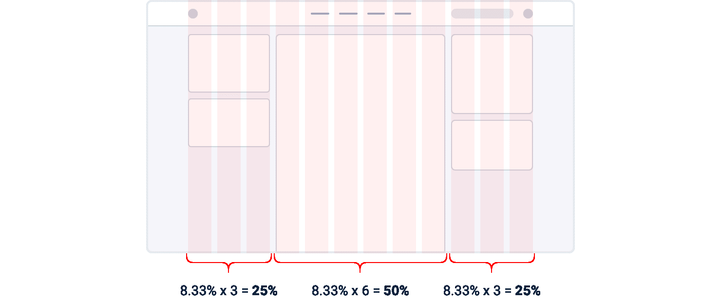
Consider the mathematical underpinnings: in the canonical 12-column framework, each individual column occupies precisely 8.33% of the available horizontal space. An element achieves grid conformity when its dimensional parameters align with some multiple of this fundamental unit (accounting for any intervening gutters).
The perilous consequence of elevating grid systems to doctrinal status emerges when we confront the multitude of scenarios where absolute dimensional specifications dramatically outperform proportional allocations. This dogmatic adherence to percentage-based measurements often sacrifices optimal user experience on the altar of systematic purity.
Consider the archetypal sidebar configuration: adhering to grid orthodoxy might lead you to allocate three columns (25%) to the navigational sidebar while reserving nine columns (75%) for the primary content region.

This arrangement appears harmonious initially, but consider the implications during viewport transformation. As the display expands horizontally, the sidebar simultaneously grows in proportion, consuming valuable pixels that could otherwise enhance the primary content area's presentation capabilities.

Conversely, during viewport contraction, the proportional paradigm forces the sidebar to compress beyond its functional threshold, precipitating typographic catastrophes through inappropriate text wrapping and unceremonious content truncation.

A more sophisticated approach involves establishing absolute dimensional parameters for the sidebar—precisely calibrated to accommodate its informational requirements—while allowing the primary content region to dynamically expand into the remaining spatial territory. This hybrid methodology permits the content area to implement its own internal grid system for subordinate element organization.