The Compensatory Dynamics of Chromatic Intensity
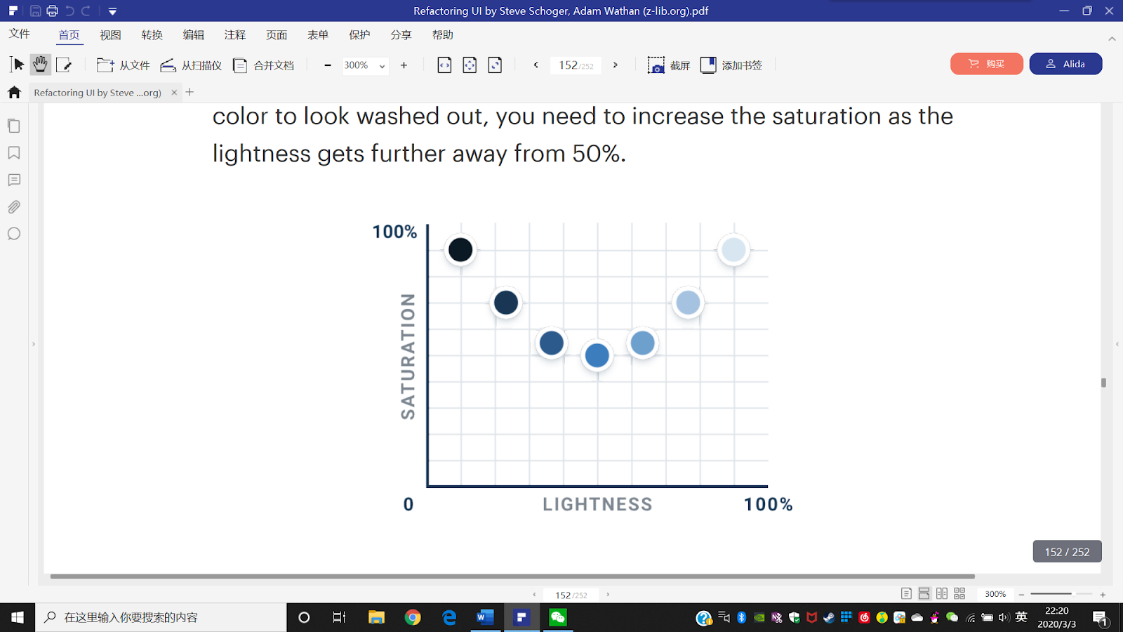
Within the HSL color model, a critical perceptual phenomenon occurs as colors approach the extremes of the luminance spectrum: the efficacy of saturation diminishes proportionally with distance from median lightness. Specifically, identical saturation values manifest with substantially greater chromatic intensity at 50% lightness compared to their expression at 90% lightness.

This perceptual constraint necessitates a compensatory approach: to maintain consistent chromatic vibrancy across a tonal range, one must progressively amplify saturation values as lightness deviates from its median value. Without this calibration, both lighter and darker variations inevitably appear chromatically diluted.
Though seemingly nuanced, these perceptual adjustments accumulate significant impact, particularly when implemented across expansive interface elements where color dominates substantial visual territory.
This approach presents an intriguing challenge: how does one enhance chromatic intensity when working with foundational hues already at maximum saturation? What recourse exists when the saturation parameter has reached its upper threshold of 100%?
Harnessing Perceptual Luminance Disparities
Consider these two chromatic specimens—which appears to possess greater luminosity?

The yellow appears unmistakably brighter, correct? Yet remarkably, both colors possess identical numerical "lightness" values within the HSL parametric framework:

This perceptual divergence stems from a fundamental principle of human visual processing: each hue possesses an intrinsic perceived luminance independent of its technical lightness value—a phenomenon rooted in the neurophysiology of color perception within the human visual system.
This perceptual brightness can be quantified through a weighted algorithm that accounts for the differential sensitivity of human photoreceptors to various wavelengths:

Analyzing equidistant samples across the chromatic spectrum—each with identical saturation (100%) and lightness (50%) parameters—reveals the remarkable variability in perceived luminance across the hue dimension:

As anticipated, yellow exhibits substantially higher perceptual luminance than blue. However, the distribution pattern defies simple linear progression between extremes—instead revealing a complex topography with three distinct local minima (red, green, and blue) and three corresponding maxima (yellow, cyan, and magenta), creating a trimodal distribution of perceived brightness across the chromatic spectrum.