Harmonizing Visual Density and Tonal Differentiation
The Interplay of Density and Contrast
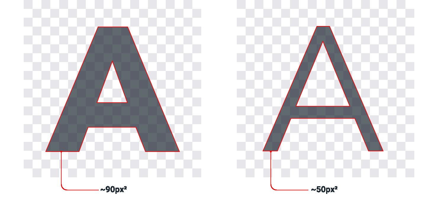
Bold typography creates emphasis through increased visual density—occupying greater surface area within the same spatial constraints, with a higher ratio of foreground pixels to background space.
This fundamental relationship between visual density and perceptual hierarchy extends beyond typography to influence numerous interface components.
Mitigating Density Through Contrast Reduction
This principle becomes particularly relevant when incorporating iconography into interfaces.
Similar to bold typography, icons—particularly those with solid fills—possess substantial visual density and occupy significant surface area. Consequently, when positioned adjacent to text elements, icons naturally command disproportionate attention.

Unlike typographic elements, icons offer limited options for density adjustment, necessitating alternative approaches to achieve visual equilibrium.