Establish a Distinctive Character
All interface designs inherently project a characteristic identity. Financial institutions typically convey reliability and professionalism, whereas contemporary startups often manifest playfulness and innovation through their visual language.

While the concept of imbuing a design with specific character attributes may initially appear nebulous or subjective, this perception belies the reality that several tangible, measurable elements substantially determine an interface's emotional resonance.
Typographic Selection
The selection of typefaces exerts profound influence on a design's perceptual qualities.
When aiming to evoke sophistication or traditional aesthetics, consider implementing serif typography within your compositional framework:

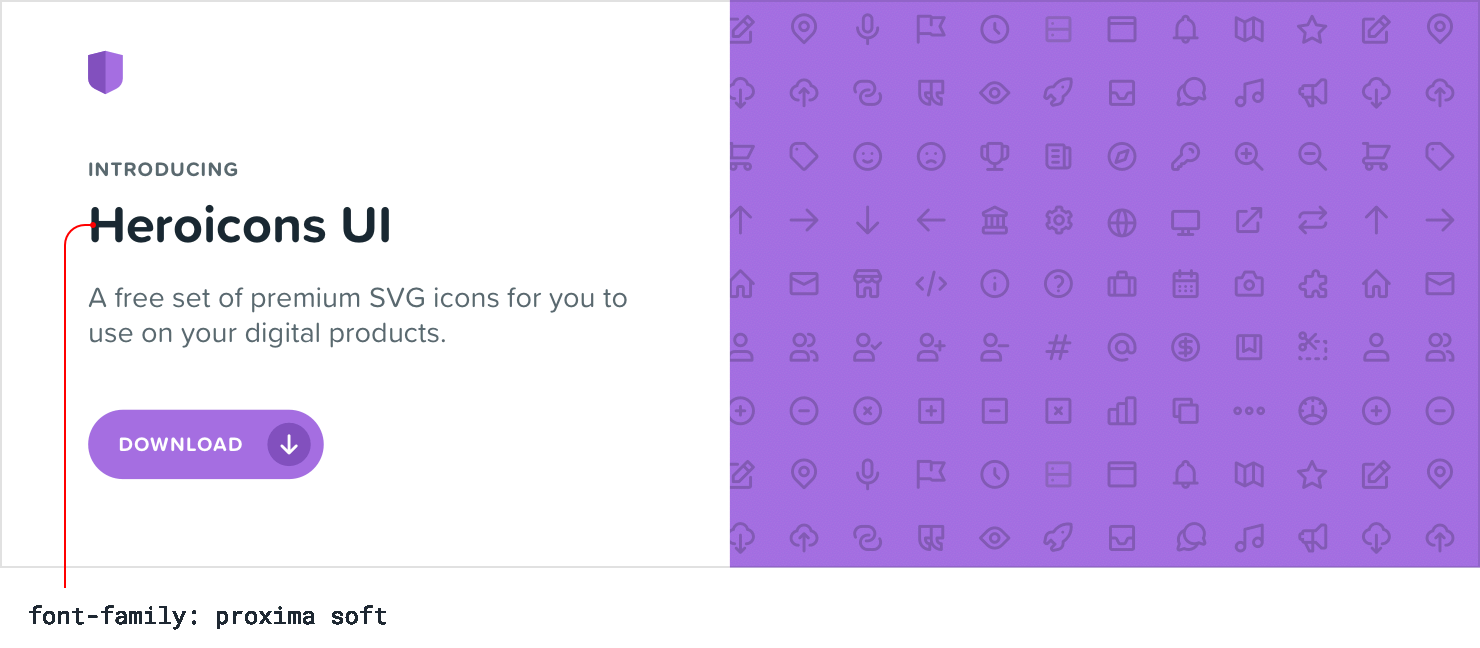
To establish a more whimsical atmosphere, rounded sans-serif variants offer excellent expressive potential:
When pursuing understated visual presentation or intending to emphasize other design components as primary character-defining elements, standard sans-serif typefaces provide an ideal foundation:

Chromatic Palette
Extensive research exists regarding color psychology, yet pragmatically, your intuitive response to various hues often provides the most valuable guidance.
Blue represents a conservative and universally accepted choice—rarely eliciting negative reactions:

Golden tones frequently communicate luxury and refinement:

Pink hues introduce levity and approachability to an interface:

Although selecting colors based exclusively on psychological principles may prove overly theoretical—aesthetic harmony often supersedes theoretical frameworks—understanding these associations can illuminate your intuitive preferences when determining appropriate color schemes.