The Chromatic Complexity of Sophisticated Interfaces
Have you encountered those algorithmic color palette generators that promise chromatic perfection through a deceptively simple process—select an initial hue, manipulate a few parameters, and receive a supposedly comprehensive set of five immaculate colors purportedly sufficient for constructing an entire digital experience?

This reductionist methodology for chromatic selection, while intellectually appealing in its mathematical elegance, proves woefully inadequate in practical application—unless your aesthetic aspirations are limited to producing interfaces with this level of chromatic poverty:

The Requisite Chromatic Spectrum
Constructing a sophisticated interface with merely five hexadecimal color codes represents an exercise in futility. Authentic digital experiences demand a substantially more expansive and nuanced chromatic vocabulary to address their multifaceted requirements.
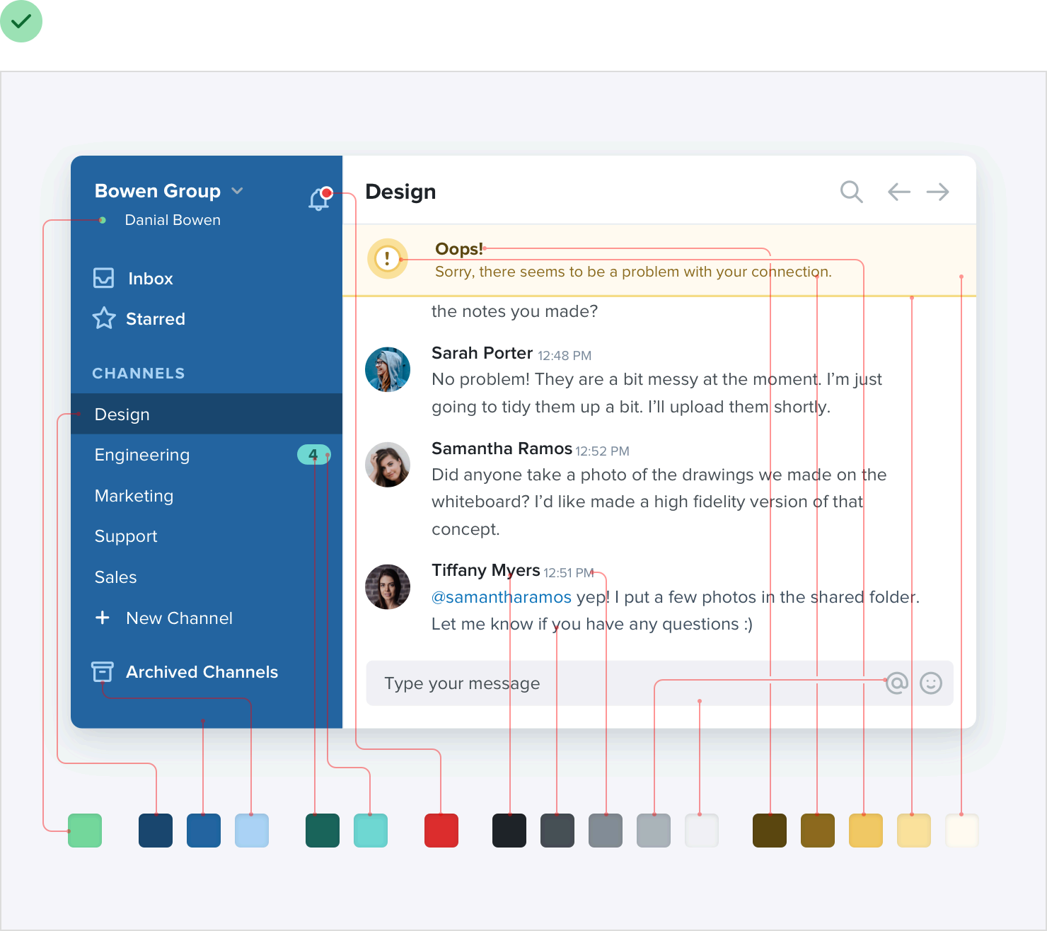
A comprehensive and functional color system can be taxonomically organized into three fundamental chromatic categories.
The Achromatic Foundation
Typographic elements, spatial backgrounds, structural panels, interactive controls—the overwhelming majority of interface components exist within the achromatic spectrum, relying on subtle gradations of neutral tones rather than saturated hues.

The requisite diversity within this achromatic palette invariably exceeds initial expectations—while a superficial analysis might suggest that three or four neutral gradations would suffice, practical implementation quickly reveals the inadequacy of such limited tonal variation. Designers frequently encounter scenarios demanding intermediary values that fall between established tones, revealing the necessity for more granular differentiation.
Optimal implementation typically necessitates between eight and ten carefully calibrated neutral gradations (a concept explored further in "Predefined Tonal Hierarchies"). This quantity provides sufficient granularity without inducing decision paralysis through excessive options—striking the delicate balance between comprehensive coverage and operational efficiency.

Absolute black (#000000) frequently presents perceptual incongruities within digital interfaces, appearing unnaturally stark and creating excessive contrast. A more sophisticated approach begins with a deep charcoal value and progresses through methodically calculated increments toward pure white, creating a harmonious progression of tonal values.
Chromatic Identity Markers
Every sophisticated digital platform requires one or two signature hues that function as its primary chromatic identifiers—deployed strategically across interactive elements, navigational components, and call-to-action interfaces. These dominant colors establish the platform's visual identity and perceptual signature, creating the immediate association that cognitively links Facebook with its characteristic blue spectrum.