The Nuanced Art of Typographic Tracking
In the meticulous craft of typographic refinement, practitioners often devote considerable attention to weight calibration, chromatic selection, and interlinear spacing optimization, while the subtle yet powerful parameter of letter-spacing (or tracking) frequently remains underutilized in the typographic arsenal.

As a foundational principle, one should defer to the typographic expertise embodied in the original design, respecting the letter-spacing decisions meticulously calibrated by the typeface's creator. Nevertheless, certain specific typographic scenarios warrant judicious modification of this parameter to achieve enhanced visual outcomes.
Condensing Display Typography
Each typographic system emerges from a deliberate design philosophy with specific contextual applications in mind.
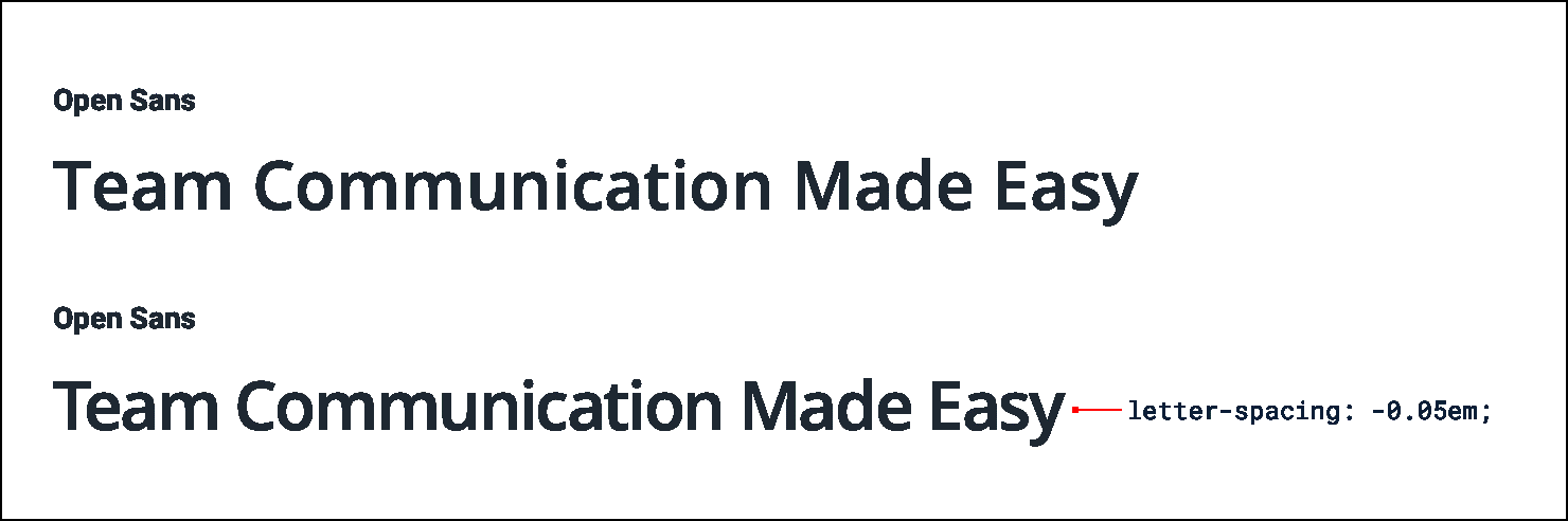
A humanist sans-serif like Open Sans was engineered with optimal legibility at text sizes as its primary objective, resulting in significantly more generous inter-character spacing compared to display-oriented typefaces like Oswald, which was specifically crafted for headline deployment.

When employing a typeface with inherently generous letter-spacing for headline applications, strategic reduction of inter-character spacing often proves beneficial, emulating the visual density and authoritative presence characteristic of purpose-designed display typefaces: