The Art of Typographic Selection
Navigating the vast typographic landscape—with its dizzying array of thousands of distinct typefaces—presents a formidable challenge when attempting to distinguish exemplary specimens from their mediocre counterparts.
Cultivating the discerning eye necessary to evaluate the nuanced characteristics that distinguish exceptional typography often demands years of dedicated observation and practice. Recognizing the temporal constraints most designers face, the following strategic approaches offer expedited pathways to typographic discernment, enabling the identification of superior typefaces without requiring extensive apprenticeship in the typographic arts.
Embrace Typographic Conservatism
When crafting interface typography, gravitating toward neutral sans-serif typefaces represents the path of minimal risk—consider the enduring success of archetypal options like Helvetica, whose balanced proportions and unobtrusive character have withstood decades of evolving design sensibilities.
For those harboring uncertainty regarding their typographic judgment, leveraging the native system font stack offers a particularly prudent alternative:
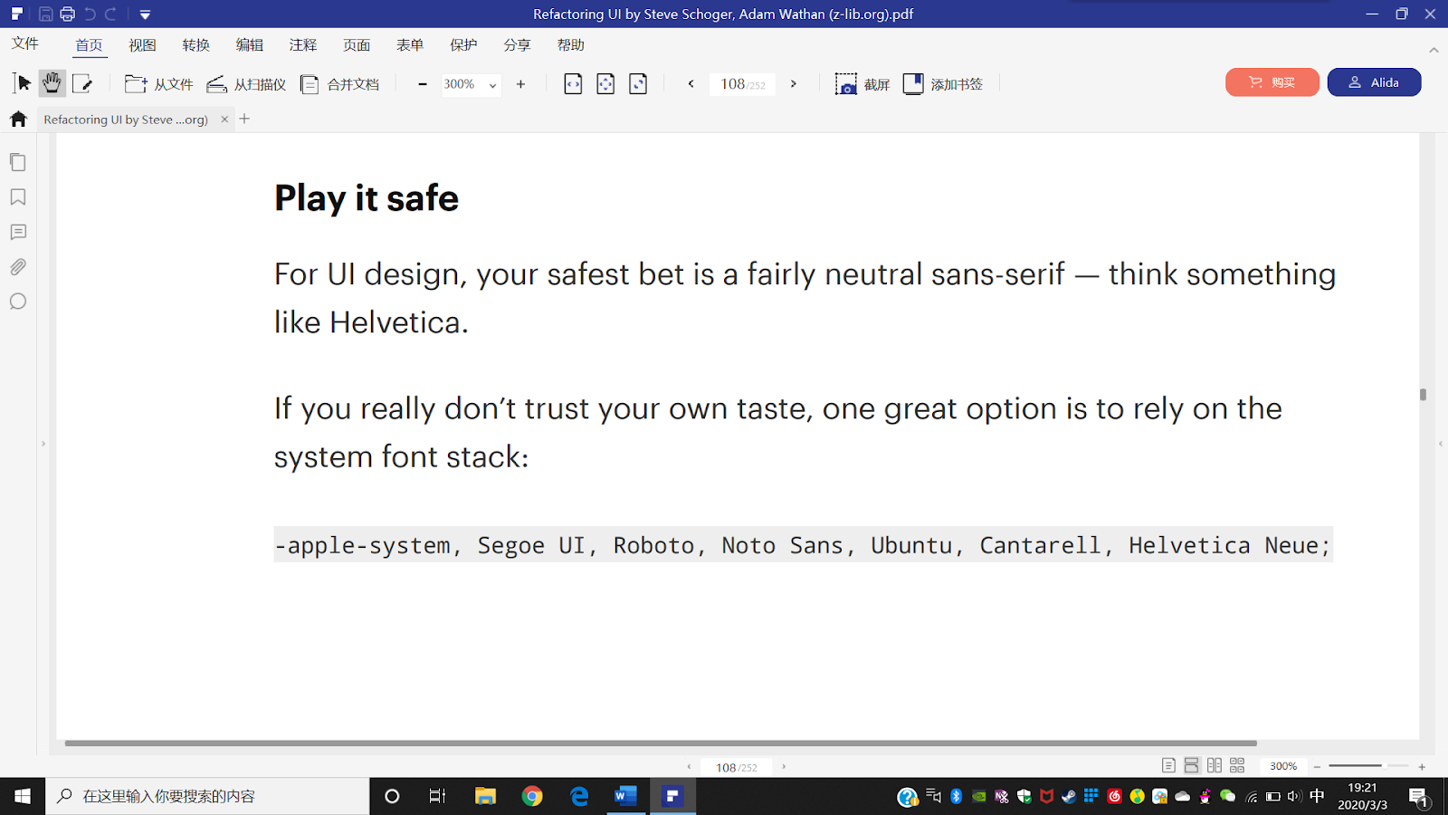
While this approach may not demonstrate extraordinary creative ambition, it carries the significant advantage of presenting users with typographic patterns to which they have already developed perceptual familiarity.
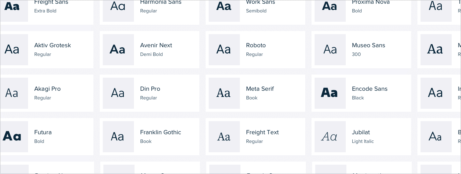
The Weight Diversity Heuristic
While acknowledging exceptions to any typographic principle, a particularly reliable indicator of meticulous craftsmanship manifests in the breadth of weights offered within a typeface family. Typefaces presenting an extensive spectrum of weight variations typically reflect a more comprehensive design process and fastidious attention to the nuanced details that distinguish exceptional typography.
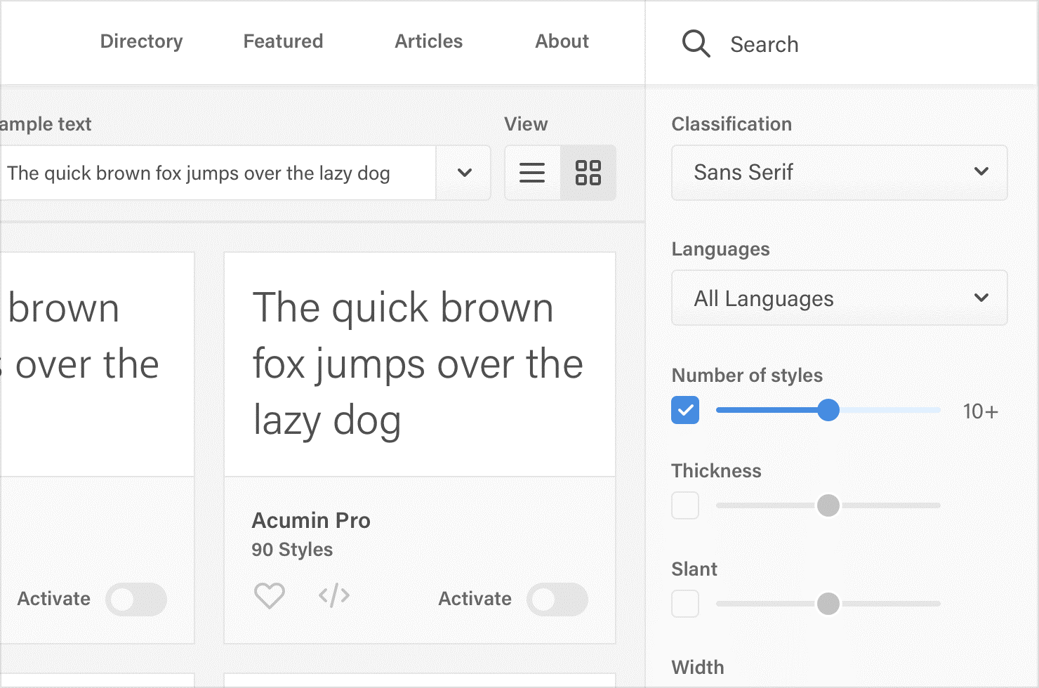
Contemporary font repositories—Google Fonts being a prominent example—facilitate filtering by "number of styles," a metric encompassing both the weight variations and their corresponding italic counterparts. This filtering mechanism provides an invaluable method for quality assessment.
By establishing a threshold requirement of 10+ styles (accommodating both regular and italic variants across multiple weights), one can dramatically refine the selection process:
This stringent criterion, when applied within the Google Fonts ecosystem, eliminates approximately 85% of available options—distilling the sans-serif category alone to fewer than 50 candidates worthy of consideration. This dramatic reduction transforms an overwhelming typographic landscape into a manageable selection of demonstrably superior options.